People have this habit of judging a book by its cover, don’t they? No matter how good and well researched the content is, users will not visit your site if it doesn’t look good. Yes, that is right. Visual appeal holds a lot of importance if you’re planning to undertake online (digital) marketing.
The information served to the reader on websites is going to be the same (more or less). So, if you wish to attract readers/users, then you need to present your content in an interactive way. To put things simply, the design, layout and colour of your website will go a long way in helping you sell your product or service. There are a number of companies in Maryland providing website design services.
Here are a few design elements that need to be incorporated within your website:
1. Do not Bombard the Home Page with Multiple Colours
This might come across as a rudimentary tip, but the importance of it cannot be undermined. Begin with the basics. Use two or three colours and give your website a fresh and lively look and feel. Using your brand colour is definitely a great idea. For instance, Vodafone, the telecommunications major, uses a couple of colours (Red and white) on its website. Using brand colours on your official website would help establish a direct connection with your users. Take this for an example: the moment you see a red,blue and white logo, you can figure out that the brand being talked about is Pepsi.
A handy tip: If colours appear repetitive, then try using different shades of the same colour.
2. Use Plenty of White Space
This part is important. Reading a 500-word long chunk of text in one go is a tough ask. Many of the readers are expected to pull out because it is bound to get a bit too overwhelming. In order to keep such situations at bay, you need to use white space. Break your content into paragraphs. Each of the paragraphs can present a separate idea to the readers/users. Also, give examples wherever necessary. Also, the space doesn’t have to be ‘white’. The term ‘white space’ symbolizes the ‘empty space’ that provides the reader/user with some amount of visual rest. In simple words, it’s a kind of breathing space.
Also, use relevant keywords. Hire a team of SEO experts in Frederick MD. This will help make life easier for you by helping you keep track of the search terms that being used frequently by your target audience.
3. No Text Overload, Please
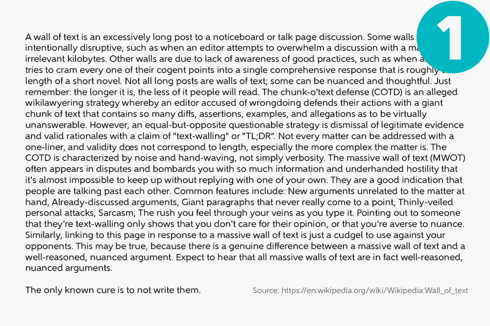
Yes, this part is really important. Having large chunks of text can leave the reader deflated and exhausted. Present your write-up using small and crisp paragraphs. Users will leave your website the moment they feel that the text being presented on the website is monotonous. Break your write-up into paras. Use headings and subheadings to present a wide range of ideas within the same write-up.

4. Use Multimedia
Experienced content marketers would be well aware of the fact that there’s a lot more to content marketing that just text. Large pieces of text can lead to monotony (let’s face it). In order to avoid all the trouble, it is important for you to use a wide range of media. Add videos if you’re preparing a tutorial. Add a video clip explaining each step if you are providing the readers with instructions. Have a message from the CEO in the ‘About Us’ section of the page.
All of these tips and tricks would go a long way in keeping the viewers hooked to the website. Despite being rudimentary, the importance of all of these elements cannot be undermined.


