Implement Appealing Visual Content on Social Media With These Smart Tactics
Social media is THE place for visual content. Platforms like Instagram, Pinterest, Snapchat, YouTube, and Facebook are all based on visual content so knowing how to create appealing content that pulls your audience’s heart strings is essential for a successful social media campaign.
If you’re like most businesses, you’ve probably created tons of written content, but no matter how good your writing is – nothing measures with the power of visuals. In this day and age, using visual content on social media is no longer a choice – it is a must if you want to reach your true potential on social media.
By learning these simple yet important tricks and tips about visual content on social media, you can dramatically improve your results.
In this article, you’ll learn how to Implement Appealing Visual Content on Social Media With These Smart Tactics
1. Have a consistent brand message with your visuals
Your visuals will help strengthen your brand message – if used correctly, that is.
Make sure that all content you share is connected in one way or another as this helps the viewers understand that the visual they are looking at is coming from your brand. In addition, sharing visuals that look similar will also help you build brand awareness.
Let me explain:
When you have a consistent theme on your visuals, you’ll make your content look more connected and appealing. Sharing the same “type” of content will also make your brand message will become more coherent.
It might sound silly but having a consistent brand message on social media has a huge effect on how your brand is seen.
Let’s look at two examples. One Instagram account who have succeeded with a consistent brand message by sharing content that is connected, and one who haven’t put too much effort into it.
Which of these do you find more appealing?
@Followmeto

@TagHeuer

While both share great content, one makes the overall look of the page more appealing by having a consistent brand message.
How can you actually do this?
There are several ways to make your content look connected and people may have different approaches to it. However, the main idea behind it is the same.
1. Use the same or similar filters. By using the same filter or filters on your visuals, you can make them look very similar even if the motives are completely different. If you wish to use several filters, settle with max three and make sure they are similar in terms of colors and look. If you choose just one, find one you like and then go with that.
2. Edit your visuals in the same way. Colors do a lot with your image. Make all your visuals black and white, increase the temperature of your photos or decrease the saturation. The important part is that you make your editing consistent.
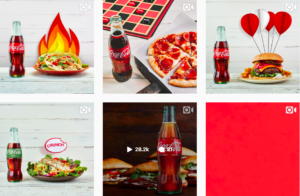
3. Focus on a few “main colors”. Choose one or more colors that you want your followers to associate your brand with every time they see that color and then implement them in all your content. One brand who have done this very well is Coca-Cola.

When looking at their feed, there is no doubt what color they want you to associate their brand with. Thus increasing brand awareness and the chance of you thinking of their brand every time you see that color.
Bonus tips:
- Add your logo to every post
- Use the same font
2. Share visuals that Entertain, Inform, Educate
These are three very important things that your content should do. Of course not all at the same time (however if you succeed with that – well done!) but sharing visuals that have different purposes will make your followers more interested in your content.
… And best of all – make them come back for more!
Sharing visuals that are one-sided is a no-no as it will make your followers lose interest very quickly and go to someone who actually provides what they want.
So how can you make visuals that fulfill one of the criteria above?
1. Entertain
More and more people use social media as their source of entertainment, instead of watching TV programs and movies. In fact, 60% of social media users are using it for entertainment purposes.
This means the demand for entertaining content is demanding. But who will provide it? You of course!
There are tons of different entertaining visuals you can share. GIFS, quotes, memes – you name it!
Here comes the but…
I am sure that some of you will be thinking “But I run a serious company, entertaining content don’t align with my brand”
While that might be true, everybody likes to have fun, no matter if they are a CEO at a large corporate or a clown.
The only question is how you are going to implement the entertaining content in your social media strategy. Because let me tell you, no matter what kind of brand you are working with, there is always room for some entertaining content. You just have to find the answer to how you’re going to implement it.
2. Inform
The most likely scenario is that people are following your brand because they want to see what you are up to, let alone stay updated with new information.
That’s why you need to inform your followers about the latest information concerning your brand – all the time and in real-time.
Your social media pages should be the go-to source for any news about your company, such as releases, sales or any other general information. When making your visuals informative, you’re also making it more attractive to follow you because who doesn’t hate the feeling of missing something?
When Rolex released a new watch during the watch show Basel World, they used their Instagram page very effectively to inform their followers about it. First, they shared two teasers that informed their followers that a new watch was coming (and when it was coming). Then, they shared a video of the new watch – the second it was launched.

This made their Instagram page the go-to source for all the people who wanted to see it, the second it was released.
In addition, because people were so exited about the new release, it resulted in tons of new followers for Rolex as people wanted to get the update about the new release as quickly as possible.
This can be seen in their follower statistics from March 22nd:

As you can see, their followings increased that day rapidly.
The best part?
You can use this too! By sharing informative content your followers care about, you’ll slowly but surely build a name for yourself, while also becoming the go-to source for the latest news and information.
3. Educate
Educating visuals are those who teach your followers new information and that help them take a stand in different subjects. Educating content also helps make them well-educated about the things in your industry – which is great for you! By educating your audience, you’ll also build interest around your niche and industry which can help attract new customers.
Infographics make the education part fun and interesting for your followers. You can also share some sneak-peaks of your ebook, post a “Fact of the day” visual or simply post some interesting statistics relevant to your niche.
3. Use eye-catching colors
Using bright and strong colors in your visuals will help your content stand out in people’s feeds. It will also grasp the attention of your followers and make it much more likely that they read the whole thing and ultimately engage with your post.
Here are some colors you should consider using when creating visuals:
- Red. Red is the most attention-grabbing color.
- Yellow. Yellow is the most visible color to the eye.
- Orange. Orange is a blend of red and yellow and is also attention-catching.
- Neon Colors. Neon colors are especially good when trying to catch the attention of teenagers.
Choosing colors strategically can help you increase your engagement and get better results from your social media campaigns as you increase the chances of people seeing your posts – not just scrolling past.
Why do you think I used the color red when marking the posts of Rolex? To get your attention to the posts that were important of course.
4. Use the same (or similar) thumbnails
A lot of platforms offers the possibility to add thumbnails.
Take advantage of these and create a consistent brand message!
When you use the same or similar thumbnail over and over, you’ll make your videos/presentations/posts instantly recognizable which help you with branding!
An example of someone who is using this strategy us Brian Dean, CEO of Backlinko.

The same design style is carried on to every single one of his YouTube videos. This means that wherever someone finds his content, they’ll be able to tell that it’s from him.
Conclusion
Visual content is extremely important for success on social media. It is what lets you stand out catch your audience’s attention.
By having these tips in mind when creating and uploading visual content on social media, we can ensure you that you’ll have great success on social media.


Your blogs are good