The Devastating Effects of Using Low-Quality Images on Social Media
Do I need to tell you about the power and importance of visual content?
If you’re working with marketing, I’m pretty sure you know about the power that visual content have.
Let’s take a look at some statistics, shall we?

- When people hear information, they’re likely to remember only 10% of that information three days later. However, if a relevant image is paired with that same information, people retained 65% of the information three days later.
- Tweets with images receive 150% more retweets than tweets without images. (Source)
- Facebook posts with images see 2.3X more engagement than those without images. (Source)
- Facebook posts with images get 2.3 times more engagement than posts without images.
- Marketers see an increased value in the use of visual content for marketing.
I think it is safe to say that visual content is crucial for social media marketing success.
But what happens when you share low-quality images on social media? Does the statistics change, or are you still able to generate the incredible results that you just saw above?
Hardly, right?
In order to generate amazing results, you need to share amazing visuals, and now that you know how important they are for social media success, there’s no reason in the world that you shouldn’t use them and put great effort into creating stunning ones.
Think about it:
When you are scrolling social media, have you ever taken a look at a post and then continued scrolling just because you didn’t feel like the post would be worth your time as a result of a low-quality visual? Be honest now!
I am pretty sure you have.
Have you ever come across a profile on social media that had a cover image in low resolution, a blurry profile picture, or simply a boring or poorly placed image?
There are many factors that make a photo good, and as someone who uses social media for marketing purposes, you need to realize that social media is heavily dependent on visual content, and if you don’t know how to craft and use visuals, it will be like fighting a swordfight without a sword.
Setting up your page with quality visuals
Most of the time, the first impression people will have with your brand and page on social media is with some kind of visual content. It might be a post you’ve shared or they might stumble across your page. If someone doesn’t know how to use the right sizes on social media, it will appear very amateurish and it will seem like you don’t know what you are doing. Of course, this is not something you want, and therefore, the foundation to creating stunning visuals is knowing the ideal formats for the different social platforms, as well as realizing that not all social platforms are created equal.

On your page, you always have a profile picture. On some platforms, you also have a header image/cover photo, but that’s only true for platforms like Facebook and Twitter.
The first thing you want to do when setting up your profile picture is to have a quality visual right from the start.
If the image you plan to use is blurry, boring, or in any way bad for some reason, you need to fix it. Don’t settle for “okay” quality. You need to have a policy to only accept the best on social media because the competition is extremely tough.
Next, you want to think about the size of the image you use as your profile picture. If the image has the wrong size, it will be cut in the wrong way, and it might even lose quality.
Here are the ultimate sizes for common images on the top social platforms:
Facebook profile image 180 x 180 (Displays 160 x 160 on Desktop)
This is the square photo that appears on your timeline layered over your cover photo. Your profile picture on Facebook will also appear when you leave a comment, share a post, and when someone searches for you with Facebook’s search feature, as well as when you post to other walls. Your profile picture will appear as 160 x 160 pixels on a desktop, 140 x 140 on smartphones, and 50 x 50 on most feature phones. Moreover, your profile photo will be displayed with 32 x 32 pixels throughout Facebook.
For business pages, the principles are exactly the same, only that your photo will appear on as 170 x 170 pixels on a desktop, 128 x 128 on smartphones, and 36 x 36 on most feature phones.
Related: How to effortlessly improve and set up your social media accounts
Facebook cover photo
The ideal size for a cover photo on Facebook is 820 x 312 pixels.
Your image will appear at 820 x 312 pixels, and if you have a different size, images will be stretched, thus resulting in a lower quality image. The minimum size for your cover photo is 399 x 150 pixels. Your cover photo will be displayed at 820 x 312 pixels on a desktop and 640 x 360 pixels on smartphones. For the ultimate results, you should upload your cover photo as an sRGB JPG file that is less than 100 KB.
Facebook posts
Ultimate image sizes for Facebook posts are 1,200 x 630, and this is the most important part. Most visuals you create won’t be profile pictures or header images, they’ll be regular posts, and it is with the posts you’ll be able to generate the best results, but setting up your page is still vital, because if you don’t have a solid foundation, it will be harder for you to continue building, and this goes for all social platforms – not just Facebook.
The recommended size that you upload a photo with when creating a post is 1,200 x 630 pixels. Your photo will then appear in feed at a max width of 470 pixels, and this will scale to a max of 1:1. On your page, it will appear at a max width of 504 pixels, and here, it will also scale to a max of 1:1.
Twitter images
Ultimate size for Twitter profile image: 400 x 400 (Displays 200 x 200)
Just like Facebook, your Twitter profile picture will be displayed at a number of places, and therefore, you want to make sure that it is appealing and top-notch in quality. Your Twitter profile picture will be square, and the recommended image size is 400 x 400 pixels. You should also note that the maximum file size 2 MB. Moreover, the image types you can use are JPG, GIF or PNG.
Twitter header image
Just like Facebook, Twitter allows header images. This is the largest image in your profile, and as a result, it is the image that people’s eyes will be drawn towards. Therefore, you need to make sure this is up to standards and encourages people to continue looking, and ultimately starts following you. Your header image can be the deciding factor if people start following you or run away from you.
Twitter post
The In-Stream Photo on twitter is minimum 440 x 220 and has a 2:1 Ratio. Note that this is the minimum to appear expanded. The maximum it can appear expanded is 1024 x 253 pixels (on a desktop. You can also tweet up to 4 images at once. A posted photo appears collapsed at 506 x 253 pixels on a desktop. The maximum file size is 5 MB for photos, 5 MB for animated GIFs on mobile and 15 MB on the web.
Instagram image sizes
Ultimate size for Instagram profile images: 110 x 110 pixels. It will be displayed in that size.
Your profile image is square, so, therefore, you need to maintain an aspect ratio of 1:1.
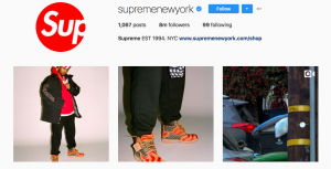
Take a look at Supreme New York’s profile picture on Instagram:

They’re a million dollar company, but still, they can’t set their profile picture to the right format. Yes, some might argue that they want it that way, but that’s not what their logo looks like, thus preventing people to build logo-awareness.
Instagram post
Your Instagram posts will be displayed at a size of 1080 x 1080. Instagram will scale these photos down to 612 x 612 pixels. In the feed, these will appear in feed at 510 x 510 pixels. Instagram supports square or rectangle photos so you need to make sure you maintain an aspect ratio between 1.91:1 and 4:5. When your posts are displayed in your profile they will be displayed at 161 x 161.
If you want to learn more about the different image sizes across more platforms, and in more detail, I highly recommend that you take a look at the “Always Up-to-Date Guide to Social Media Image Sizes” by SproutSocial.
Let’s dig into the nitty-gritty of visual content on social media and talk more about how you can improve your visual content.
A big problem with social media is that many of the social platforms compress your images. This can result in blurry, low-resolution images that attract no-one. You can blame the platforms all you want, but do you think that your audience will care what your excuse is?
No!
People won’t overlook it, because other people can still, with the circumstances they have, they share high-quality grasping images. And if they can do it, you can too!
Instead of blaming the platforms, which helps no-one, you should instead make the most out of the situation and make the most out of your preconditions. A part of that is understanding the formats, which I talked about, but another is to create visuals that are high-quality and appealing right from scratch.
How can you create visuals that your audience care about and that aren’t low-quality?
When I am talking about low-quality visuals, I am not only talking about the graphics of the visual. I am also talking about the visual itself and what it is. If you share a post with a visual of a dog, when your target audience are cat-owners, your visual will be considered to be low-quality not necessarily because of the fact that it is blurry, but because it is isn’t interesting to them! A piece of visual content can be top-notch in all ways, but if it isn’t relevant to your audience, it will get the stamp “low-quality”
You need to post the right visuals at the right time.
Conclusion
Visual content on social media can make or break you. The statistics prove that visual content is extremely powerful and effective on social media because humans resonate with it and can absorb information better when it is displayed in a visual form. The only problem is that millions of millions of pieces of visual content is being shared every day on social media, so there is no room for “average” or “below-average” visual content.
In order to succeed in the social media landscape, you need to share top-notch visual content every time


