E-commerce is one of the most rapidly increasing business models in the world.
How is that?
Let’s back up this claim with some facts. In an estimated global population of 7.7 billion, 25% of this whopping figure shop online. This exponential rise in trend will hit the enormous 2.14 billion mark of the world population by 2021.
Amazing!
Yet another interesting fact is that e-Commerce sales would amount to 13.7 percent of the total retail sales across the world in 2019. Tracking the growth trends, e-Commerce sales will occupy a whopping 17.5 percent of the worldwide retail sales by 2021.
These figures are good enough to support our claim of the fastest growing business model today and the years to come.
But today, we are not here to discuss the rising importance of the e-Commerce business. We assume that you have been smart enough to own an e-Commerce store already.
The next big trend which we all are familiar with is Mobile commerce and how it is leading a new industrial revolution. Statistics show that Mobile Commerce is expected to cover 67.2% of the total digital sales in 2019. And the trend keeps swelling to reach a whopping 72.9% by 2021.

Therefore the next big question would be how to optimize your e-commerce website for mobile devices?
Don’t worry! With this article, we aim to help you make some changes to the conventional features of your store. Consequently leading you to Mobile e-Commerce optimization.
Here are some of the e-Commerce “tried and true” features worth implementing in your store for a better user experience and more conversions.
1. Remove the Wishlist Feature.
Your e-Commerce store aims to provide the users with their required products/services within a few seconds. Wishlist is nothing but a way which leads customers to procrastinate their purchase decision. As a result, Removing the Wishlist Feature from your store will result in removing unnecessary distractions to your users.
Eliminating the Wishlist feature is delivering positive results across all the device types for the core metrics. Hence optimizing your Mobile e-commerce site sales.
Moreover, the absence of “I will buy it later” mentality will create a sense of urgency for the user. As a result, the focus of the user is solely on the “Add to Cart” button, which increases your rate of conversion.
The statistics behind this suggestion for detaching the Wishlist feature show a huge impact on mobile shoppers.
The Revenue Per Visitor (RPV) on mobile has witnessed a positive lift of 81.6 percent on removing the wishlist feature.
Removing the Wishlist feature can be initiated by any merchant who has it in their existing stores.
A word of caution needs to be shared with the merchants in the fashion industry. As this particular segment has observed mild dips in the revenue on removing the wishlist. Causes for the same are explained as users save items in the wishlist and wait until their look is complete including the accessories. Another reason behind this tumble lies in the fact that users save their favorites in the hope to buy them during seasonal sales.
2. Suppress Breadcrumbs.
Implementing breadcrumbs on your e-Commerce site has become a convention.
Breadcrumbs are implemented to help users sort the product views on the basis of category, subcategory, and product. They also help shoppers determine which category the product is from and even find their way back in case they landed on a wrong product search.
By suppressing the product’s name in the breadcrumb feature is actually leading to an enormous positive impact on mobile shoppers.
They say testing the most conventional things sometimes might help you generate more profits. So removing a redundant product name from the breadcrumb trail has observed a positive lift.
An average RPV increase for about 17.2 percent of mobile checkouts and 9.33 percent of desktop users says it all. Suppressing the breadcrumbs at the product name level is going well for over 80% of merchants.
Moreover eliminating the redundant reload of the same page and removing the visual distractions (long breadcrumbs) are yielding positive RPV. Where simplifying the breadcrumbs do not yield any good, on the same hand, removing the breadcrumb is a straight NO.
This feature can be implemented by all the e-Commerce merchants who already have breadcrumbs on their e-Commerce store.
And those who do not have them at all should initiate and include mentioning breadcrumbs to observe a lift in their RPV.
3. Auto Cart Update
Everyone is busy and in a rush, needs to have shopping experiences as soothing as a breeze.
Hence Auto Cart Update is a feature that you must include in your e-Commerce store to reduce friction and update the cart quantities automatically.
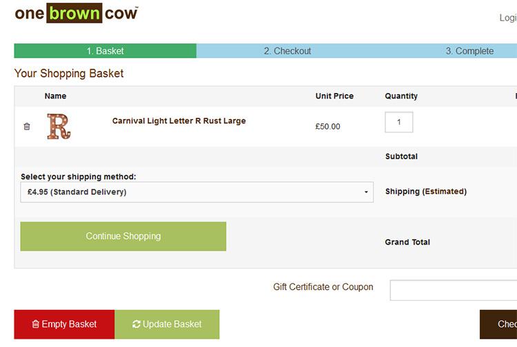
Against the convention, we propose eliminating the requirement of manually clicking on “Update Shopping Cart” which might give shoppers relief. Implementing an automatic update of the cart as soon as the quantity of the product is updated will lead to a reduction in shopper friction.
Where removal of an unnecessary button de-clutters the cart page, it also makes users feel good. This elimination has seen a positive impact on over 95% of the visitors and becomes a part of best practices for mobile checkout.
With an exceptional and greatest impact on new users, the “Auto Cart Update” feature has seen a positive lift of 32 percent RPV.
This functionality can be and should be implemented by any e-Commerce store owner who has manual cart update functionality on his store and get it mobile optimized.
E-commerce entrepreneurs need to understand that the Auto Cart feature can give a real boost to the sales conversion process of a business. Even if you are in the dropshipping business, you can work on the Auto Cart feature to improve your chances of successful sales.
If entrepreneurs wish to know more, they can take help from credible dropshipping ecommerce course to understand how they can optimise their businesses for the best results.
4. Suppress CONTINUE SHOPPING Button
We all are quite familiar with the small “Continue Shopping” button inviting the shoppers to spend a little more yet again. This button is most commonly and conventionally found on the cart pages and even on Checkout ones.
Usually placed close to important CTA (Call To Action) buttons like “Update Cart”, this conventional “continue shopping” button when put to test, tells unusual things.
And it reveals that suppressing Continue Shopping button has observed a modest lift in RPV in over 69% of mobile checkouts. Observing a positive lift in RPV of about 1.41 percent for mobile users, it is concluded that the continue shopping button proves to be a visual distraction. And clicking on this button takes the users away from the checkout funnel thereby reducing the chances of completing the purchase process.

Whereas the desktop users had an opposite reaction. Suppressing the Continue Shopping button has actually observed a negative impact on RPV of 5.04 percent of the desktop users.
As desktop users have been seen to purchase more than just one product/service, suppressing the Continue Shopping button shows us the results otherwise.
5. Reconfiguring CONTINUE SHOPPING Button
Usually, on clicking the Continue Shopping button, the user is redirected to the home page of the e-Commerce site. Even this conventional step when tested gave breakthrough results.
When Continue Shopping page is reconfigured to redirect the user to their last shopping category marked a significant increase in RPV.
This step has been taken as a user-friendly measure and has observed an overwhelming increase of 21% of the RPV for desktop users.
Desktop users are assumed to browse more and even buy more than one product at one time. Hence it is beneficial to take desktop users back to the category where they last shopped.
A significant difference in behavior has been noted when a user is taken to the home page rather than one who is taken back to the last category.
While on the other hand, mobile users have lesser browsing time and the usual behavior of not buying multiple products. Hence, there is a negligible reduction in the RPV for mobile users on reconfiguring the continue shopping button.
6. Collapse Coupon Promo Field.
Most of the merchants use coupon codes on their e-commerce stores. As a part of the marketing initiative, coupons are aimed to encourage sales and to get visitor attention.
But in reality, asking for coupon codes to the customer just before he has to complete the checkout process seems to be a big distraction. It causes him to get diverted. In finding the maximum discount coupon on various coupon sites he leaves his cart abandoned.
Collapsing the coupon code and gift code fields, not only simplified the cart page but also encouraged a better focus on completing the checkout process.

It would really be a pleasant surprise for you to know that with this effort, the RPV on all the device types was lifted. More precisely mobile devices exclusively observed an increase of 8.04% in revenue per visitor.
Isn’t it great!
If you still want to know that this might be good for your e-Commerce store or not, here is what we recommend.
This is a rather exciting option for any merchant who has a coupon/discount code field on their checkout page.
Closing Notes
All the effort put in this blog was to make you all aware of the features which have formed a convention, which actually pays off more with a change.
And all the tests to which these conventional-looking features have been added, have shown a positive RPV except for removing the breadcrumbs.
Key takeaways from this endeavor to drive more conversions for your E-commerce store are:
* First, start with removing wishlists as an experiment. Observe any positive lift in your RPV across your mobile and desktop users. Analyze and compare the increase in RPV with the utility of including a wishlist on your e-store.
* Second, just like removing the breadcrumbs did not serve any good, similarly, it’s high time to introduce the breadcrumbs on your site for your users.
* Third, when it comes to the inclusion of breadcrumbs, you need to experiment with it. Try it with different variations and find one which simplifies the user experience.
* Fourth, for your mobile users, you can actually remove the CONTINUE SHOPPING button. This is tested to remove distractions and render an optimized mobile experience.
* Fifth, RECONFIGURING CONTINUE SHOPPING button can be a great opportunity too. You can test to redirect your users either to their last shopping category or to the product detail page. Instead of taking your user to the home page to start their journey all again, redirect to relevant places.
* Sixth, Mobile Commerce Optimization is the need of the hour. To stay ahead of your competition and be loved by your users, you need to keep experimenting with new things. Optimizing and delivering an unmatched experience to your audience is the key to success.
Always put the conventional features to test and never take them for granted! Because this will lead your store to new heights.
To learn more about improving your e-Commerce store visibility & to increase store sales, visit 12 SEO tips to boost your store visibility in 2019 and 9 SEO Trends to drive Traffic and sales in 2019


