We enjoy seeing how, with simple marketing tools and cleverly crafted text, we can elevate businesses to an entirely different level and attract potential customers without being intrusive. Today, we’ll discuss one tool that will capture your attention: drumroll… Pop-ups. Easy? Yes. Is it worth using in your branding? Absolutely!
An email pop-up is a small advertising announcement that appears when users visit your website. Typically, they offer you a specific discount, service, or gift in exchange for subscribing. Sometimes, they remind the company that you would appreciate it if you followed their activities. With a variety of popup templates available, finding one that aligns with your brand’s aesthetic and messaging has never been easier. Regardless of the type of pop-up you choose, the main goal is to prompt action: helping you expand your database, reach your desired audience, or attract new customers.
So, how can you effectively and correctly use pop-ups in personal branding to resonate with your customers and keep everyone happy and satisfied? Let’s delve into this in detail here so you can take advantage of it.
How to Improve Your Business with Pop-Ups
Don’t be pushy
Nobody likes spam. Suppose people were previously interested in your products or activities and subscribed to various newsletters and advertisements. In that case, your email will likely get lost among hundreds of others or end up in the spam folder. Therefore, it’s important to remember that sending thousands of emails won’t lead to better branding results. Marketing strategies constantly evolve, and what worked before may need to be more effective today.
Internet users can easily switch to other brands. To avoid this, small pop-up windows should contain a clear offer. What does this subscription offer the potential customer? A discount? Interesting content?
A powerful combination of text and visuals
Excessive text is unnecessary. This isn’t a school essay; you need concise text, a clear call to action, a click, a reward for the user, and data for you. People grant you access to their data by subscribing to you, allowing you to learn more about their preferences and adapt products to suit their tastes. Yet, you need more than good text; you also need appealing visuals. After all, it’s common for people to judge by appearances; they often choose based on the cover before reading.
Your pop-up should have a genuinely stylish appearance. If you overdo it, the reminder may irritate visitors to your site, and they’ll simply close it. From our experience, you only have one chance, practically a moment, to captivate with a pop-up. Ultimately, the person will either be indifferent and close the ad or genuinely interested, and that’s when their email will be in your hands!
Keywords and examples
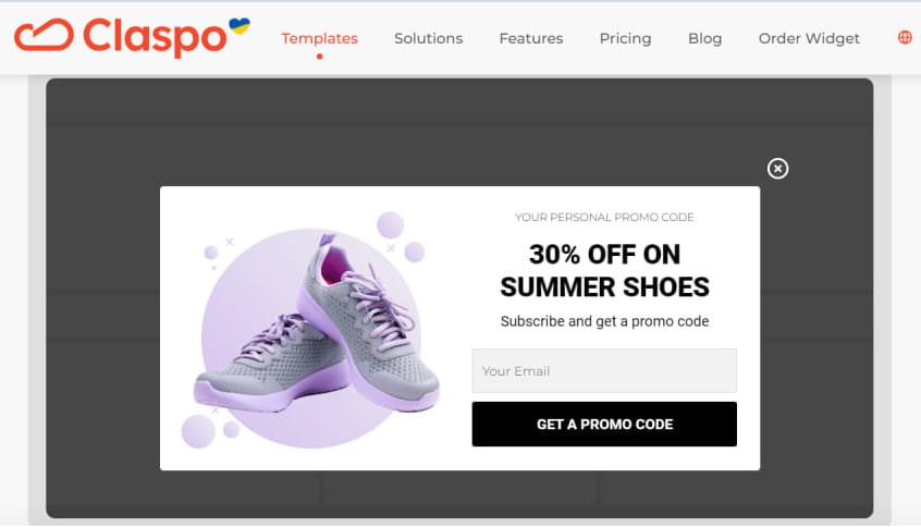
Keywords are those two or three words that catch the eye of your email subscribers. They are usually highlighted in bold text or placed in a way that immediately grabs the reader’s attention. For example, in a pop-up featuring purple sneakers, we see the perfect visual, which captures our attention. It contains concise text with keywords such as “30% off” and “summer shoes”.
At the bottom, you can notice the black-highlighted text, “Get a promo code”. Despite the discount statement being the most prominent, this black button also doesn’t go unnoticed.
Let’s consider another example where a company is not offering discounts or prizes but instead asks the user to join a community to follow content and updates: simple design and a clear request. If people visiting the site are genuinely interested in its content because it’s high-quality and offers valuable information, they will gladly take a few clicks. Such subscriptions can help you save money and find an audience since only some companies can afford to give gifts, especially charitable ones.

The right moment for pop-ups
Have you ever visited a website with an advertisement popping up every five seconds? Did you stay on such a site for long? We doubt it. A similar situation applies to pop-ups. Using them excessively and at the speed of lightning is unnecessary; it will only annoy people and leave a negative impression of your entire website, product, or service.
To make pop-ups work effectively, you need to calculate when and how frequently they should appear and ensure they align with the displayed page. Another crucial detail: pop-ups must be relevant. They should appear in connection with the content the user is viewing. Is it appropriate for a potential customer to see a pop-up discounting office bags while shopping for sports attire? Put yourself in the users’ shoes, view everything from the perspective of someone new to your site or interested in the content available on your platform, and then analyze the data as a brand owner.
Conclusion
To create an impressive pop-up, you need to pay attention to details. Experiment, play with colors and text, try different approaches, and you will find the perfect pop-up. You can also consider contacting companies specializing in creating pop-ups tailored to your needs.
When you do it correctly, you can attract a large audience or customer base, increasing your chances of promoting your brand. Pop-ups can be one of the best ways to build a connection between you and your users. Transform intrusive advertising into a pleasant bonus for site visitors.


